Project 3: Flight Safety Data
A project to explore airplane flight safety data and statistics.
Abstract
Flying has long been considered one of the safest ways to travel — particularly when compared to automobiles. However, because of recent unfortunate airline crashes, it is now being presented to the public as one of the most dangerous. In fact, numerous media outlets around the country have been touting statistics stating that flying is no longer a safe way of traveling. News and media outlets have bombarded the public with statistics and figures about airline safety trends, and are reporting, overall, that things do not look good for the industry. With that narrative in mind, a study was undertaken to look into historical data of airline and automobile incidents, crashes, and fatalities, and also to dig deeper into the underlying factors of the most recent airline crashes, to truly understand if what is being presented by the media is accurate.
Introduction and Background
This report will focus on the safety of airline travel and whether more recent crashes are a cause for concern for both the airline industry and the general public. This report is intended to focus more on the data presentation and visualization component of the field of data science, and while there is more than just exploratory data analysis involved, the primary objective of this project and this report is to show the data’s findings — the data story — in a manner that can be easily consumed and understood by everyone, from business executives making decisions involving billions of dollars about their airlines, to the average individual wanting to make a personal decision about whether they will be safe if they choose to book a ticket and fly to visit family.
Problem Statement
The primary problem I would like to solve is determining if any of the relatively recent concerns and fear of flying are actually warranted, or if they are overblown. Is flying still safe? Are there any common underlying factors that are causing airline crashes?
Data Sources
The data I’ll be working with for this project will come from the National Transportation Safety Board (NTSB), the National Highway Traffic Safety Administration (NHTSA), and the Aviation Safety Network:
- Aviation Safety Network (ASN): Databases from https://aviation-safety.net/database/
- National Highway Traffic Safety Administration (NHTSA): Data from https://www.nhtsa.gov/data
- National Transportation Safety Board (NTSB): Data from https://www.ntsb.gov
Methods and Technical Approach
The information presented here is built upon information from airline safety data provided by the Aviation Safety Network, which has aviation safety records dating back to 1919. For the scope of this project, I will be looking into 35 years worth of airline incident, accident, and fatality information — more specifically those from the years 1985 through 2020. Using that information, I will look for trends when comparing the airline incident and fatality data from three different chunks of time, one grouping from 1985 through 1999, another from 2000 through 2014, and the last from 2015 through 2020. By comparing these three different chunks of airline safety data, any solid correlations should present themselves relatively clearly. For example, is it the same airlines that are having safety issues across this 35 year span? Are there any patterns in the geographical location of the airlines that have incidents? What about aircraft? Is there any data that shows a particular type of make or model of aircraft that is prevalent in the airline incident, crash, or fatality statistics?
As a means of comparison to one of the most common methods of travel — and to accurately have a comparison of fatality data — a supplemental data set from the NHTSA (National Highway Traffic Safety Administration) with automobile fatality information covers similar years and allows for a one-to-one study of fatality numbers across these most common uses of travel throughout the world.
Examining the Data
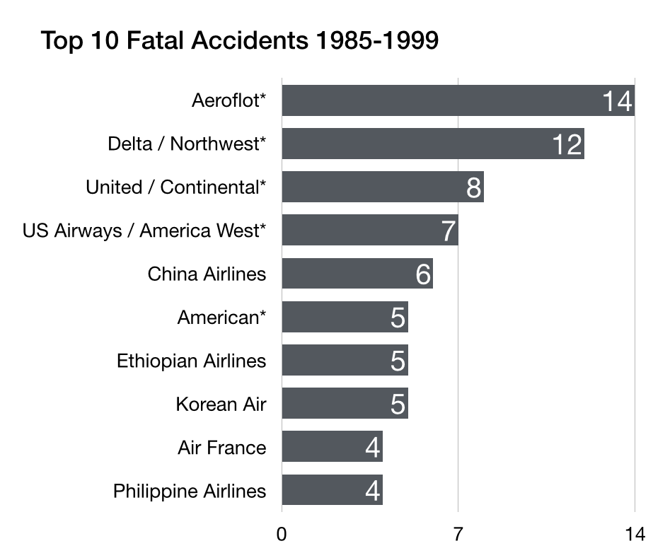
To answer the question of whether flying is still safe, we look to the data; it is telling a far different story than the one projected in media reports. The following two charts show the top ten fatal accidents in the airline industry over two different chunks of 30 years of data:
 |
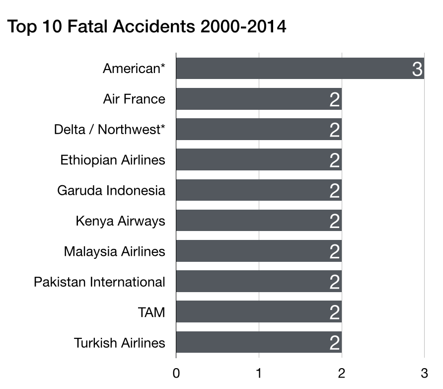 |
When looking at the fatal accident data from 1985 through 1999 on the left and the accident data from 2000 through 2014 on the right, it is easy to see that it is not the same exact airlines experiencing fatal accidents over these 30 years, rather, it is somewhat random: the same airlines that had fatal accidents in the past were not prone to repeat them. Another big piece of information from the airline fatality data is that the total number of fatalities is actually decreasing, and by a rather significant amount:
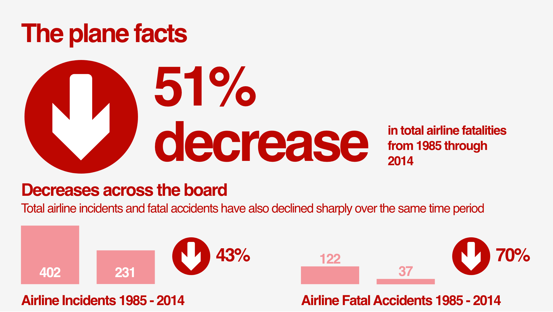
In fact, the total number of fatal accidents across all airlines from 1985 through 1999 was 122, while the number from 2000 through 2014 was 37, a decrease of 70%.
The more recent events of Boeing’s 737 MAX aircraft and its MCAS problems highlight the issues driving the recent media push to question the safety of air travel. In fact, I argue that this particular aircraft and its issues are the primary impetus for the outcry:
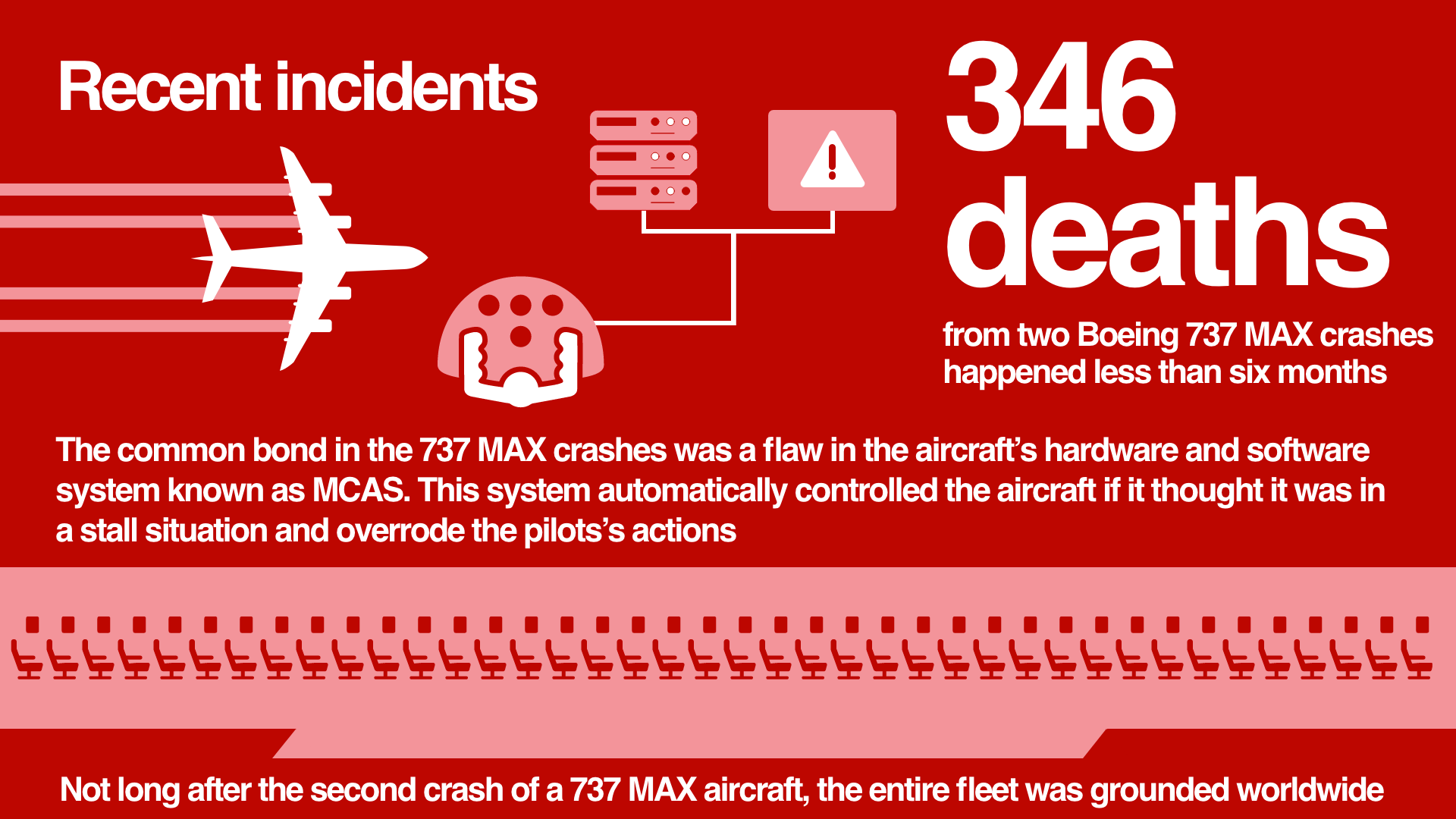
The fatalities from this particular aircraft came from two different flights less than six months apart in late 2019 and early 2019, each from different airlines. But their common bond is the flaw in the aircraft’s hardware and software system (MCAS) that automatically control the pitch of the aircraft if it detects a stall position. Not long after the second crash of a 737 MAX aircraft, the entire fleet was grounded worldwide.
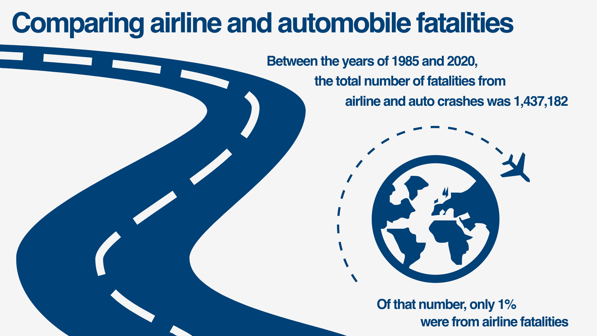
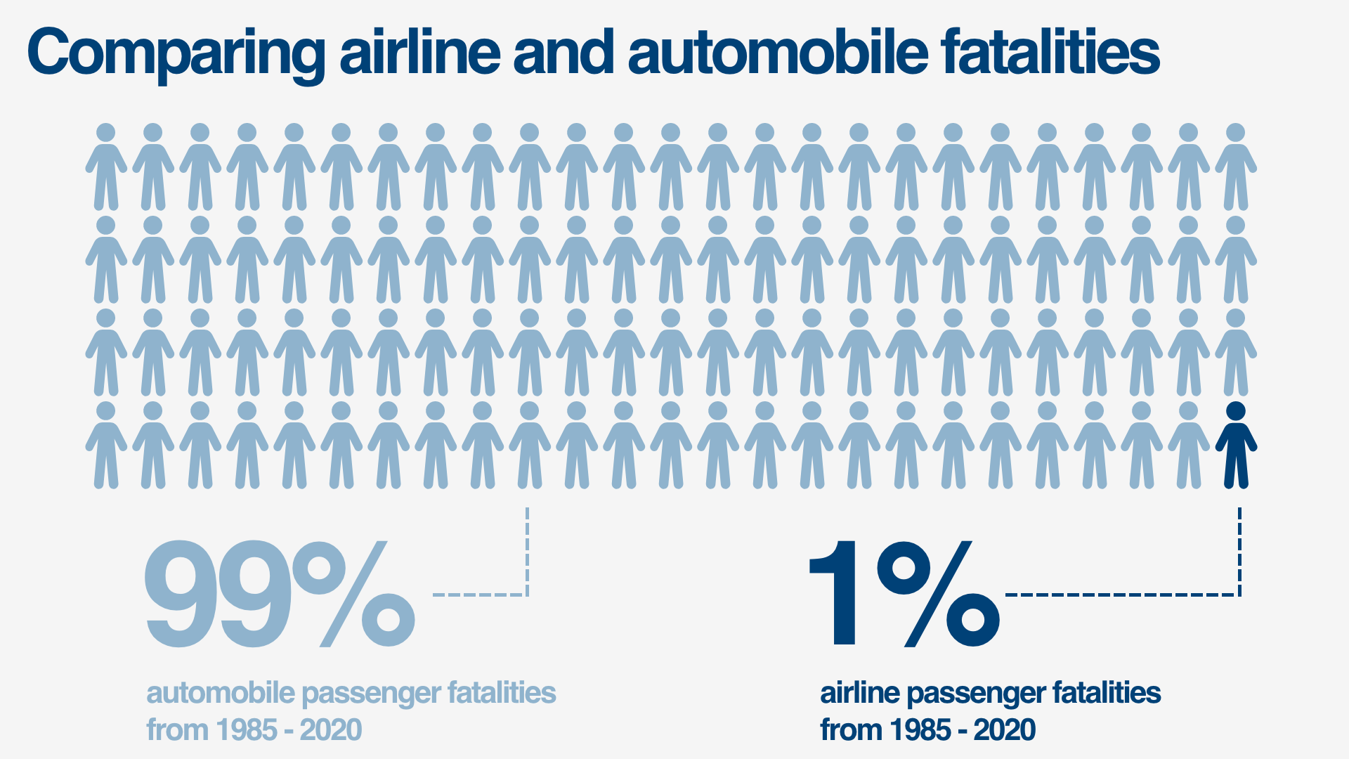
The last story to come from the safety data is the most compelling. This data compares total fatalities from flying and driving over the years 1985 through 2020. The difference in the fatality numbers is striking:
Conclusion
Based upon the findings, despite recent fears of flying, with the exception of a faulty hardware and software system on one particular aircraft (Boeing’s 737 MAX), traveling by plane is still extremely safe compared to other methods of travel.
Airlines that had incidents or fatal crashes in the past are not necessarily prone to have them happen again. Also, the data shows that the number of incidents and fatalities over 30 years have dropped quite a bit, and they are not particular to one geographic location, though there is evidence that airlines from developing countries are more prone to incidents, accidents, and fatalities.
Comparing the fatalities of airline travelers and those in automobiles provides a rather telling statistic: between the years of 1985 and 2020, the total number of fatalities from airline and auto crashes was 1,437,182. Of that number, airline fatalities make up only one percent of that total. Flying continues to be one of the safest methods of getting from one location to another.
References and Annotations:
- Silver, Nate. (2014). “Should Travelers Avoid Flying Airlines That Have Had Crashes in the Past?” from https://fivethirtyeight.com/features/should-travelers-avoid-flying-airlines-that-have-had-crashes-in-the-past/.
- Aviation Safety Network. (2021). Databases from https://aviation-safety.net/database/.
- Creswell, Julie; Glanz, James; Kaplan, Thomas; Wichter, Zach. (2019). “After a Lion Air 737 Max Crashed in October, Questions About the Plane Arose” from https://www.nytimes.com/2019/02/03/world/asia/lion-air-plane-crash-pilots.html.
- Delbert, Caroline. (2020). “The 737 MAX Has Been Grounded for a Year Because of Its Terrible Computers” from https://www.popularmechanics.com/science/a32142441/boeing-737-max-computer-problems/.
- Pasztor, Andy and Tangel, Andrew. (2020). “FAA, Boeing Blasted Over 737 MAX Failures in Democratic Report” from https://www.wsj.com/articles/faa-boeing-blasted-over-737-max-failures-in-democratic-report-11600246802.
- Gelles, David. (2019). “Boeing 737 Max: What’s Happened After the 2 Deadly Crashes” from https://www.nytimes.com/interactive/2019/business/boeing-737-crashes.html.
- National Highway Traffic Safety Administration. (2021). Data from https://www.nhtsa.gov/data.
- National Highway Traffic Safety Administration. (2021). NCSA Tools, Publications, and Data from https://cdan.nhtsa.gov.
- National Transportation Safety Board. (2018). “Investigation of Lion Air Flight 610 and Ethiopian Airlines Flight 302” from https://www.ntsb.gov/investigations/Pages/DCA19RA017-DCA19RA101.aspx.
- National Transportation Safety Board. (2019). “NTSB Issues 7 Safety Recommendations to FAA related to Ongoing Lion Air, Ethiopian Airlines Crash Investigations” from https://www.ntsb.gov/news/press-releases/Pages/NR20190926.aspx.
Project Proposal
Which Domain?
What domain is this data going to come from? Please list 10 references (with a brief annotation) to use to make sense of what you’re doing with these data.
This project will focus on the safety of airline travel and whether more recent crashes are a cause for concern for both the airline industry and the general public.
Which Data?
What is the dataset you’ll be examining? Please provide a codebook if there is one or a link to the dataset as well as a detailed description.
The data I’ll be working with for this project will come from the National Transportation Safety Board (NTSB), the National Highway Traffic Safety Administration (NHTSA), and the Aviation Safety Network.
Research Questions? Benefits? Why Analyze these Data?
How are you proposing to analyze this dataset? This is about your approach. Here, you’ll be proposing your research questions as well as justifications for why you’d offer these data in this way.
The genesis of this project began in previous work for this course, and I wanted to extend it by looking at additional years and see if there are any other trends to discover. For example, how did the number of airline incidents, crashes, and fatalities look during the years 2015-2020? Are there any things that stand out in this data? How did airline incidents compare to auto incidents?
What Method?
What methods will you be using? What will those methods provide in terms of analysis? How is this useful?
The primary method that will be used to present the airline safety data’s story will be infographics. I wanted to key in on this method as a way to present the data to show a more well-rounded portfolio.
Potential Issues?
What challenges do you anticipate having? What could cause this project to go off schedule?
Like most of the projects, my primary concern is time and being able to get everything wrapped up and presented in a way that I am happy with.
Concluding Remarks
Flying has long been considered one of the safest ways to travel — particularly when compared to automobiles. However, because of recent unfortunate airline crashes, it is now being presented to the public as one of the most dangerous. In fact, numerous media outlets around the country have been touting statistics stating that flying is no longer a safe way of traveling. News and media outlets have bombarded the public with statistics and figures about airline safety trends, and are reporting, overall, that things do not look good for the industry. With that narrative in mind, a study was undertaken to look into historical data of airline and automobile incidents, crashes, and fatalities, and also to dig deeper into the underlying factors of the most recent airline crashes, to truly understand if what is being presented by the media is accurate.
Project Check-In
Any surprises from your domain from these data?
So far there are not too many surprises from the data that I am working with, other than the number of airline fatalities for the year 2017, which was extremely low at only 44 from 10 crashes. That is almost mind blowing when you stop to think about it! Certainly any number of fatalities are horrific, but the fact that only 44 lives were lost in airline crashes that year definitely stood out to me when looking over the data from years 2015 through 2020.
Is the dataset what you thought it was?
Going into this last project, I was expecting it to be much easier to find readily available downloadable datasets for the airline fatality information for years 2015 through 2020. And while to some extent that is true — as the years 2015 through 2019 weren’t too difficult to attain from ASN (Aviation Safety Network) — I ended up doing a lot of my work manually — which seems to be a trend in my projects, unfortunately. The 2020 airline fatality data could have been scraped from the https://aviation-safety.net/database/dblist.php?Year=2020 page, and automation could really make all of this a lot easier if there was a lot of data to scrape; however, with just a bit more than 300 rows, it was easier and faster to copy and paste the data from the web page’s table into a spreadsheet.
Have you had to adjust your approach or research questions?
Luckily, I have not had to adjust my research questions nor my approach, and this is most likely because this project is an extension or addition to one that we took on in a previous course, DSC 640 Data Presentation and Visualization. I wanted to focus in on the presentation and visualization elements for this final project, and I was very curious about how the fatality numbers looked for the most recent years after the 1985 through 2014 timeframe that were part of the 640 work.
Is your method working?
Yes, my method is working with no issues, and I plan to present updated visuals and graphics representing these additional years (2015 - 2020) of this extended study. Will the trend of decreasing airline fatalities continue for this five year stretch compared to the previous years, or will there be some of an upward trend? It will be most interesting to see things charted out.
What challenges are you having?
One of the biggest challenges I had was one that I touched on earlier, and that was getting compiled airline fatality and crash data for the year 2020 from Aviation Safety Network (ASN), the primary resource used for the project data. I am convinced that is only because that data is compiled and presented in the format that I was used to seeing for the other years sometime later in the year, and it just hadn’t been done yet this early in 2021 for the 2020 year. As discussed, I copied and pasted the table of individual crashes from 2020 from their website into my own spreadsheet and was able to do the summary and count functions easily.
Questions and Answers
Why did you choose this as a project subject?
I really enjoyed the Data Visualization and Presentation course in Bellevue University’s Data Science program, most likely because it’s the perfect intersection of data and design, an intersection that’s right in my wheelhouse as an interface architect and interface designer in my day job. The primary project in that course taught us how to use numerous tools and programs to “tell the data’s story” and I wanted to continue looking into airline safety data with data from the last six years.
Did anything during this project surprise you? In what way?
There were not too many surprises with this project, as the data from 1985 through 2014 seemed to carry on with years 2015 through 2020 — travel by airline is still extremely safe; however, there was one rather big surprise. For the year 2017, there was an extremely low number of airline fatalities with only 44 deaths as a results of ten crashes. That is almost mind blowing when you stop to think about it! Certainly any number of fatalities are horrific, but the fact that only 44 lives were lost in airline crashes that year definitely stood out to me when looking over the data from years 2015 through 2020.
Is there anything that you would have done differently?
I think for the scope of this project that the methods taken were very sufficient and worked out really well, Perhaps I could have looked more into individual airlines from these laters years of data and presented that. Another item that could have been useful to dig deeper into would be the reason(s) for airline crashes such as human error, mechanical failure, etc.
Did you get all of the answers to your research questions?
Yes, I was able to get all of the answers to my research questions, primarily the answer to if the years 2015 through 2020 would show that flying is still a safe means of travel, despite more recent events.
What would you have liked to have gone better?
I’m not sure that I have a good answer for this one, as I was pretty happy about how everything with the project went.
How do you feel about the impact of data visualization?
Data visualization is such an important tool. Just as getting the data’s story accurate is essential, so is presenting it. Data visualization is like music or a movie; there’s a story being told and the ability to do it in a way that captures the audience is essential. Cluttered and/or confusing visuals make all of the hard work of the previous steps in the flow of data science all for nothing.
What good (if any) came as a result of this project?
For me personally, I was glad to see the data showing that airline travel is still extremely safe. With the 737 MAX issues, I was really starting to worry about flying, but once I understood that there were hardware, software, and regulatory issues at fault, and just for this new aircraft, I felt relieved.
Are there any other research questions you would like to try to find answers for?
One of the items from the last few weeks that might be worth exploring is engine fan blade issues and how prevalent that internal stress fractures are within fan blades. Does this issue impact just particular engines and designs. Also, why did the entire engine cowling for the flight that left Denver for Honolulu break away? That is not supposed to happen.
Is data visualization the most important aspect of data science?
I don’t know if it’s the most important, but it certainly is extremely important. The old adage that “a picture is worth a thousand words” is very appropriate in the ream of data science, for sure.
Is data visualization something that you would like to continue working on?
Presenting data stories through data visualization is definitely something I’d like to continue working on. I’ve always been drawn to well-done data visuals and graphics. The more influential ones I’ve seen lately are interactive and are extremely effective and really make the audience stop and thing. This one recently done by Reuters reflecting the 500,000 lives lost to COVID-19 is a great example of that: https://graphics.reuters.com/HEALTH-CORONAVIRUS/USA-CASUALTIES-CHRONOLOGY/xklpyomnrpg/index.html.
Full Infographic


